A grid system was derived, as although this is a modernist design technique it allows for details to be formatted clearly. The grid system was put in place in order to allow myself knowledge of the pages centre etc, rather than to restrict the movement of design. The grid therefore being a rough guide rather than a restrictive mechanism.
Spread comparisons
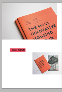
When completing the spread layouts multiple approaches were derived. The above two screenshots show how different compositions are able to explore different meanings. The 1st design contained mass negative space, with the designs appearing balanced. This felt very modernist and thus the below approach was outlined. Less balance was derived in the second piece, with a 'tag' being explored to highlight the designers name. This went outside the grid boundary and thus made the design feel more modernist.
Ethical implications of spreads were considered, as within the above spread both women in lingerie and burkas are depicted. This was commented upon by one of by peers and thus it was decided that the design should be altered. Within editorial it is important to ensure that all spreads compliment one another, and thus a resolution was made.
Simons feedback on spreads...
Simon suggested that some of the work exhibited did not explore the style of work mentioned within the essay but rather aesthetical pieces. He also suggested that some of the work did not have a relationship to the feminism mentioned and thus should be excluded. As a result of this the above spread was eliminated.
Negative space became a key influence when designing, as this allows for postmodern placements to appear clean, clear and easy to navigate. Negative space also allows the imagery present to appear more effective, as the colours used stand out against the white background.
The 'tag' names of the individual artists are captured within a rectangular strip. The placement of the text is not centralised, in turn allowing negative space to be present within 'random' aspects of the shape. This in turn promoting postmodernism.
General layouts do not aline imagery, this breaking many boundaries. The tagline present within different spreads are randomly placed, this making each page different.
Crit
When discussing the spreads with my peers they suggested that the layout was strong and appeared visually engaging. The random nature of the spreads was unpredictable and thus made every page interesting to navigate. The selected imagery worked well together, and it was evident that complementary colours had been placed alongside each other. It was also suggested that the tagline appearing on the page was far easier to navigate that my original thought of listing the designers within the back. Although stating this it was suggested that a list of the designers should be mentioned within the back, as well as the collective itself. In turn developing a well rounded product.


No comments:
Post a Comment