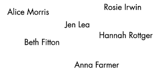
As within feedback it was stated that the previous 'members' page was extremely overcrowded, and felt to not follow the design traits of the previous pages, a simpler design was explored.
The first idea explored a very structured approach. The names were placed in a format whereby all the names developed a pattern. In turn promoting the strength in which a collective expresses. Although the concept behind this was liked, I decided that the approach did not explore the 'postmodern' trends in which are highlighted within the essay. It also does not promote the line work expressed throughout the previous designs.
The second approach followed a more randomised approach with the names being randomly placed. This was effective but didn't contain any line work and thus further experiments were made.
A design in which promoted line work was then completed. The strict nature of the lines, alongside the mirroring names, felt very modernist and thus it was decided that a loss bold approach should be derived.
The amount of words upon a line was also reduced in order to comply to Vignelli's Cannon. This in turn promoting legibility.


No comments:
Post a Comment