In order to discover a suiting typeface extensive research was conducted into other bold san serifs, some of the findings have been noted below.
When researching into the most 'loved' typefaces, it became evident that there were 5 key typefaces in which are said to be the UK's favourite.
- Helvetica
- Garamond
- Frutiger
- Bodoni
- Futura
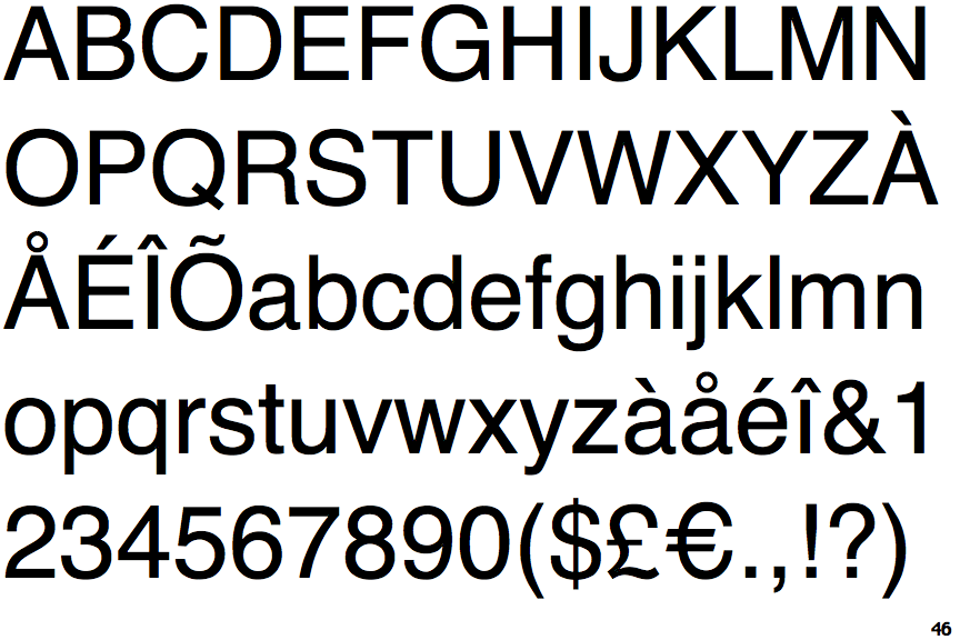
Helvetica-the worsts most favourite typeface-has its own documentary-sans serif
Helvetica is based on the Akzidenz-Grotesk model. It pretends to be the epitome of modernity but it actually more or less resembles the modernity of the end of the 19th century. Of course the typeface has been modernized compared to Akzidenz-Grotesk, but nevertheless you may notice distinctly antique letterforms, most notably in the letter 'a'.

Garamond-serif typeface
Some distinctive characteristics in Garamond's letters are the small eye of the 'e' and the bowl of the a, which has a sharp hook upwards at top left. The 'M' is slightly splayed. The x-height (height of lower-case letters) is low, especially at larger sizes, making the capitals large relative to the lower case, while the top serifs on the ascenders of letters like 'd' have a downward slope and rise subtly above the cap height. Garamond typefaces are popular and often used, particularly for printing body text and books.

Frutiger-sans serif

Bodoni-serif typeface-commonly used within fashion magazines
When first released, Bodoni and other didone fonts were called classical designs because of their rational structure. However, these fonts were not updated versions of Roman or Renaissance letter styles, but new designs. They came to be called 'modern' serif fonts and then, until the mid-20th century, they were known as Didone designs. Bodoni's later designs are rightfully called "modern", but the earlier designs are now called "transitional".

Futura-sans serif-first typeface to appear upon the moon
Futura is a geometric sans-serif typeface designed in 1927 by Paul Renner.Futura has an appearance of efficiency and forwardness.Renner's design rejected the approach of most previous sans-serif designs (now often called grotesques), which were based on the models of signpainting, condensed lettering and nineteenth-century serif typefaces, in favour of simple geometric forms: near-perfect circles, triangles and squares. It is based on strokes of near-even weight, which are low in contrast. The lowercase has tall ascenders, which rise above the cap line, and uses a single-story 'a' and 'g', previously more common in handwriting than in printed text. The uppercase characters present proportions similar to those of classical Roman capitals
Summary
From completing research into these key 5 typefaces it is fair to suggest that they are all strong, and prominent typefaces. As I want my design to mimic Paula's in some sense I belive a sans serif would be most effective. In conjunction to the above research and the findings of Vignelli, it has been decided that both Helvetica and futura will be explored with. Helvetica due to its close relationship with Akzidenz-Grotesk, and futura due to to its impact and beauty.
"A Guide To The Most Loved And Hated Fonts - Vandelay Design". Vandelay Design. N.p., 2017. Web. 9 Apr. 2017.
No comments:
Post a Comment