Primary research was undergone into the formation of design catalogues. A variation of catalogues were explored, with it being evident that no female design catalogues could be found. This again supporting the idea that more design catalogues should be developed in which aim to promote female design.
When reading the catalogues it was evident that there was a divide between the number of female and male designers mentioned, with a bias towards males being present. This then again supporting the reasonings behind the development of the catalogue.


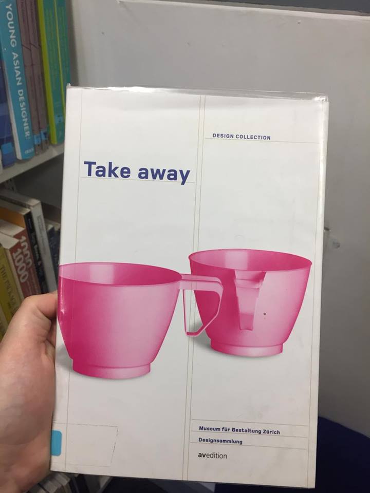
A variety of approaches were explored, with common connections being drawn. It became evident that the general aesthetic of the catalogues were very simple, in order to promote the individual's work rather than to promote the designer themselves.
The two above approaches follow two very different styles. The first approach focuses purely upon typography, a factor in which allows the consumer to gain instant knowledge upon the catalogues subject area, whereas the second deisgn expresses smaller typography within a piece of iconography, in turn making the consumer work harder to find the information. As the catalogue would be given to a primary audience of males aged between 40-55, this must inform my own publications design.

The two above designs again take very different approaches. The first appears minimal in style, allowing for negative space to shape the design. Hierarchy appears present within the sizing of typography, this again resulting in the consumer being drawn to the title. The second approach explores both image and type in form to develop a balanced cover. The typography appearing vertically expresses a more interesting piece as this forces the consumer to take due note of the type, and not simply read and dismiss it. This may be explored with in my own design.


The arrangement of spreads is highly important as the editorial of the piece can influence the impact on the consumer greatly. The first design explores large imagery amongst mass text, this has been used in order to express balance within the piece. The second deisgn follows another balanced piece also the breaking up of text through imagery is far more effective, as the text appears reduced. In turn making it less daunting.
Other influencing factors include the usage of colour, as this again aids the breakdown of mass text. Typography, type size and type setting are also key relevant factors that must be considered when developing m own deisgn.
No comments:
Post a Comment