Sunday, 23 April 2017
Study task justification
In relation to the previous study tasks developed surrounding design boards, it is fair to suggest that these were developed before the concept of the practical was fully developed, and thus the final design boards maintain a more concentrated approach of a correct manner.
End of module evaluation
Overall, I believe that I have fully engaged with COP. Multiple attempts have been made in order to better my essay, with Simon supporting this, and influencing the ways in which the essay should be formatted. I have attempted to make strong links between my essay and practical work, as this is the criteria in which my COP lacked in level 4.
The essay itself highlights the lack of women within design and the reasonings behind this. The practical work has taken key statistics surrounding young female designers, and attempted to develop a platform in which female creatives work may be exhibited, in turn promoting female deisgn to creative directors.
A collective was developed, through young female designers at LCA, with the idea that future designs may be used to promote this.
The publication was developed in order to express this directly to creative directors, as research found they are far more inclined to explore physical work than digital. The logo for the collective in which was expressed on the front cover was said to have been somewhat offensive to male designers. As a result of this, the logo will be changed before a 'real' publication is developed by the collective.
When trying to promote the collective's work within the design, it was discovered that many members didn't want to submit as they had not finalised pieces etc, and as a result other female creatives were used. Although their permission was asked, no response was gained and thus this could not be developed commercially.
In order to gain feedback from the design, I sent the publication to rabbit hole, a male based deisgn studio in leeds. So far no response has been made.
When thinking about the key challenges of the project, I personally found it difficult to explore with colour. As it was discovered that some think pink is a feminist colour and others do not. I decided myself that it was not offense, as feedback was gained from peers, as well as online.
Mock ups were developed in order to promote the best design possible, with this aiding with the overall design process.
Friday, 21 April 2017
Final Evaluation
Final Evaluation


When firstly analysing the concept of the design it is evident that there would be a market for such a product, but rather so there is a need for this product, in order to promote female design and equality within the creative industries.
The idea of a 'collective' developed publication would be strong, as it would allow multiple females to explore their design work in a fun, safe environment.
When thinking specifically about the publication, it is evident that costings would need to be considered if taking this project further. A good way in which to get such funding maybe to hold exhibitions, and sell the designers work. This would provide money as well as promoting the female designers further.
In design terms the aesthetic of the publication will firstly be discussed. The general layout is bold and impactive. Minimal in nature the designs do not appear crowded, and your eyes are drawn to the workings of each indvidual designer. Making the publication A5 has allowed this further, as less images can appear upon an individual page, in turn promoting only a couple of design pieces at a time. I believe this to be far more effective than listing numerous designers upon one page.
The nature of the spreads attempts to capture postmodern trends, with less obvious layouts being taken. Although this concept is strong, I am unsure upon whether the design correctly captures postmodernism, and thus I believe a more abstract approach should have been taken.


When thinking specifically about the logo, it has appeared evident within critiques that many of the males I asked felt that it excludes men. As feminism is a movement of equality rather than female 'supremacy', I believe that this logo may not be that effective. Although its general design is so. As a result of this, I will attempt to take the principals of the original logo and apply them in a different manner, in collaboration with the rest of the collective. This operation will be undergone throughout the summer months, to allow a strong focus.
Colour has been a key influence throughout the whole design. A three colour tonal approach was developed in order to express a clean, yet bold approach. The pink used highlights femininity in a positive manner, as the colour pink previously had 'negative female connotations'. The typography used was that of Futura, a strong san serif typeface. This typeface was selected as it mimics the work of Scher's, alongside other strong postmodern female designers.
The production of the publication was relatively straight forward. A simple staple was used in order to bin the magazine together. This is in order to comply to that of magazine standards, as well as expressing a cheap manufacturing method. The stock used was recycled in order to promote environmental design, an issue in which I am very passionate about. The stock used was matt, in order to create a juxtaposition between the normal 'glossy' magazines in which represent women so badly, heat being an example. A gsm of 200 was used for the cover, as within the stock up the cover felt very malleable, the inside spread was also apparent through the cover, hence why this was changed. An inner gsm of 160 was used in order to again combat the transparency issue as well as promoting a high standard publication.

Website
The website itself is easy to navigate, clean and clear. Postmodern trends within the publication have been mimicked throughout the design, although similar to the publication I believe that these could have been pushed far further.
The idea of a website would allow the consumer to further engage with the designers, discover more creatives, and gain information surrounding the collective. One idea in which was suggested to me by one member of the collective was to have a forum page added to the website, in turn promoting an open discussion between designers. This would be a great idea to engage with further creatives, and thus if the website goes live this will be an added feature.
in order to promote continuity the website mimics the same typography/colour scheme as the publication. This in turn promoting the two together.
When thinking about the general layout of the website, I believe some pages to not correctly explore postmodernism and thus this would be an area in which I would suggest needed improvement.

Target Audience
When thinking about how the demographic will interact with the outcomes, it must be considered that legibility is a key factor. As within my previous feedback it states that some of the typography used is difficult to read due to sizing, this will be altered. As the primary audience is males, it must be considered wether the line through the word male is effective, or whether it does appear man hating. Other than this I would suggest that both outcomes are clear, easy to navigate and promote legibility. In turn effectively targeting the intended demographic.
Future?
When thinking about the future of the outcomes/collective it is evident that there are a lot of issues in which must first be overcome. Funding is essentially one of the key areas in which must be firstly completed, with exhibitions etc being held in order to fund the publication. Secondly, as a collective we must develop a new logo in which does not appear to exclude males but holds the same ethos. The colour should also be altered in order to promote a more 'friendly' pink. Some areas of the publication, alongside the website must be altered in order to promote postmodern trends more effectively, as well as following a clean design.
Tuesday, 18 April 2017
Production
When thinking about the realities of the outcomes, the production must be considered.
As the publication cost £3.60 to print, it is fair to suggest that it would be very expensive to send a copy to every design agency in Britain. As a result of this a cheaper printing solution must be found. When printing in bulk it is often cheaper, and thus this may be an idea.
Some printing companies were researched in order to gain a rough estimate of how much the publication would cost to print.

80p each when 250 copies are bought

74p each when 250 copies are bought
From completing this action it is evident that the mode price for the booklets when printed on mass scale would be around 75p per booklet. As a result of this, I believe with funding from the collective, this may be possible.
As the publication cost £3.60 to print, it is fair to suggest that it would be very expensive to send a copy to every design agency in Britain. As a result of this a cheaper printing solution must be found. When printing in bulk it is often cheaper, and thus this may be an idea.
Some printing companies were researched in order to gain a rough estimate of how much the publication would cost to print.


From completing this action it is evident that the mode price for the booklets when printed on mass scale would be around 75p per booklet. As a result of this, I believe with funding from the collective, this may be possible.
The outcomes relationship to the essay
The outcomes relationship to the essay
When thinking about the final products relationship towards the essay, it is evident that postmodern trends have attempted to be captured. Scher's has been a key influence throughout doing this. In order to ensure the essay links closely to the final outcomes, the conclusion from my essay has been analysed in comparrison to the prcatical work. This is outlined below.
'Women within design have often been isolated and ignored, this primarily being due to the ways in which women have been positioned throughout history; the weaker, less achieving sex. This is evident through the lack of strong female designers being noted before the 1960’s.’Design history has long overlooked women in our narrative, despite continuously having a large group of women active in the field of graphic design over the past century.’ (Hinn) Highlighting that it was not the design in which was hidden from the public eye but rather the female designer. Due to the feminist movement these inequalities were outlined and women began to become aware of their rights. In relation to this, female designers provoked the rise of the feminist design movement, allowing a form of feminine design in which had not previously been highlighted to be expressed to that of a mainstream audience, with iconic female designers such as Scher leading the way. From this pivotal moment within history, design has said to have changed forever, incorporating that of feminine trends, and postmodernist values, in turn allowing women to be embedded within design culture.
In a world whereby gender equality is still not present, fifty years since the initial phase of feminism, it may be suggested that gender inequalities are due to genetic trends, and the males need for hierarchy. Although this theory is not credible, and the reasonings behind this suppression are still little known, the most likely theory suggests that this injustice is due to the structure of society and its placement of women. Although the reasoning is unknown, women of today must still strive for a neutral, same opportunity future.' (Morris, 2017)
Comparisons
As within the essay it is suggested that women have been previously labelled 'the weaker, less achieving sex.', this has attempted to be removed within my own design outcome. Futura, a strong sans serif has been used in order to embody the idea that women are strong and resilient. The usage of a sans serif was also selected as designers mentioned, such as Scher frequently use them within their work.
Another quote in which has been visually represented within within the practical work is 'design in which was hidden from the public eye but rather the female designer.' This quote suggests that it has not been female design in which has been overlooked previously, but rather that acknowledgement of female designers. As a result of this the production of a female design catalogue allows female designers to be mentioned alongside their work. In turn promoting the idea that female designers deserve as much acknowledgment as males.
'suggests that this injustice is due to the structure of society and its placement of women. Although the reasoning is unknown, women of today must still strive for a neutral, same opportunity future.' When thinking about society placement of women, it should be noted that mass small actions will help promote equality within society, and the design industry. I hope that the collective, and my final outcomes may help assist with this.
As within my research it was discovered that men still take up the majority of design jobs, I hope that my outcomes will help assist in promoting equality within the design industry.
Feedback from the demographic
Although I do not personally know any creative directors who are in this demographic, I decided to send the publication to a couple of the most prominent creative studios in leeds, in which have a largely male employment rate. When sending the publication, feedback was asked for...So far no response has been made. This is most likely due to myself sending the publication not that far away from the deadline. If no response is made before the deadline, I will write about the feedback on my PPP blog.
in order to gain some other forms of feedback, I asked some male family members between the ages of 35-55 to interact with the outcomes. Although this individuals are not creative, this still gave me an insight into how this demographic would interact with the design.
Feedback given
Roy, 53
in order to gain some other forms of feedback, I asked some male family members between the ages of 35-55 to interact with the outcomes. Although this individuals are not creative, this still gave me an insight into how this demographic would interact with the design.
Feedback given
Roy, 53
- Very clean, eyecatching
- The images on the website should be bigger
- Good use of imagery
Mark, 54
- Easy to read
- Type on the 1st page could be bigger
- web link on back page should be bigger also
Arwell, 35
- Interesting design
- The websites easy to use
- The colours used are strong
From the feedback gathered it is evident that some of the sizing within the publication needs to be altered in order to express a more legible publication.
Final Feedback
In the final critique mass feedback was gained surrounding both the publication and app. Some of the comments have been listed below.
Publication
When discussing the publication with my peers they suggested that the concept behind the piece was very strong, as more female designers need to be embedded within design. They also suggested that the proposal for further designs was interesting.
When discussing the front cover of the design there was a split reaction. With some finding the logo relevant and others finding it offensive. Those who suggested it was offensive went onto state that the design appeared man hating, as if the design was ruling out males altogether. Although many alterations were completed in order to reject this ideology, it is apparent that it is still present. As a result of this, within future publications for the collective, a new logo will be developed. In turn promoting the idea of equality. It was also suggested that the line through the text appeared red, and therefore if I were to keep to the original design a brighter pink should be used, in order to promote a more friendly nature.
When discussing the word choices within the publication, it was stated that the word strong was used twice within the opening paragraph. This should be eliminated in order to promote a more sophisticated design.
In terms of composition and layout, it was suggested that the minimal layout was strong, and that there were obvious postmodern characteristics embedded, although stating this it was suggested that these trends should be pushed further. In turn promoting a design in which effectively explores female design.
It was also suggested that the line work within the publication effectively highlighted the designers expressed.
In terms of production it was suggested that the matt stock used was appealing. It was also suggested that the weight of the stock was effective, as the reservable images were not seen. It was also stated that the image quality was high. One comment suggested that a spot varnish would appear effective when used on the images, as this may make them stand out and feel more appearing. This is definitely a factor in which I would consider in further publications.
Website
When discussing the website with my peers they suggested that it was easy to navigate and felt very spacious. The minimal design was said to be effective, although it was suggested that postmodern trends were only implemented in certain pages with others appearing very modernist. When looking back of the designs it became apparent that this comment was highly relevant.
They went onto suggested that the general website was highly professional, including the imagery used. It was suggested that the negative space used allows attention to be gained by the images. This being effective as most websites have mass information/images close together. Although stating this it was then suggested that the images should be bigger, this therefore being more suitable to the intended demographic.
The line down the centre of the page has said to guide the consumer, making the overall design easier to read.
Do they both work in sync?
When discussing the two designs with my peers they suggested that the two designs appear very similar. They both explore the same typography and colours. They both also use a similar layout, in turn promoting postmodern trends.
Feedback from the collective
When showing the collective my designs they suggested that they were highly effective at targeting the demographic. They also suggested that the designs would appeal to a secondary and tertiary audience, in turn promoting female design.
Alterations made
As within feedback it was stated that the previous 'members' page was extremely overcrowded, and felt to not follow the design traits of the previous pages, a simpler design was explored.

The first idea explored a very structured approach. The names were placed in a format whereby all the names developed a pattern. In turn promoting the strength in which a collective expresses. Although the concept behind this was liked, I decided that the approach did not explore the 'postmodern' trends in which are highlighted within the essay. It also does not promote the line work expressed throughout the previous designs.

The second approach followed a more randomised approach with the names being randomly placed. This was effective but didn't contain any line work and thus further experiments were made.

A design in which promoted line work was then completed. The strict nature of the lines, alongside the mirroring names, felt very modernist and thus it was decided that a loss bold approach should be derived.


The amount of words upon a line was also reduced in order to comply to Vignelli's Cannon. This in turn promoting legibility.
Monday, 17 April 2017
Feedback
From the spreads developed feedback was given. It was suggested that the general aesthetic of the design was strong, although some spreads needed alterations.
Firstly, it was stated that the 'members' page was very crowded, with the large typography feeling somewhat overpowering and not complying to that of the other spreads. It was also suggested that some of the words were larger than others.
Other comments made were generally about the 'rules' of graphic design. For example the line length in some paragraphs needed to be shortened, in order to apply to Vignelli's cannon.
Other spreads
The previous spreads developed were used as a basis for the remaining slides. Centralisation was a key factor in which was incorporated.


With the individual pages, it was decided that a layout in which explores the style of the individual should be expressed. This therefore meaning that all 6 members pages will be different. In the above example a simple grid system has been put in place in order to embed the structure of Jen's work. This will be applied to all members individual pages. The designers themselves could develop their own page, in turn promoting their own design.
When discussing the design with my peers they suggested that the 'burger' icon increased click counts largely, and thus a normal bar should be put in place on each page to easily allow the consumer to navigate to each individual page. It was also suggested that the 'burger' icon would not appeal to this demographic and thus should be removed.
Sunday, 16 April 2017
Members page
When thinking about the ways in which the members page will be formatted, it was evident that good feedback was maintained surrounding the idea of expressing the members in a similar format to the logo itself. In turn promoting the idea that the members build up the collective.


The members names were firstly explored, with the 'crossing out' appear present. This felt somewhat destructive of the members names, and thus an underlining approach was explored. This seemed to lift the text, in turn promoting the word.


From this a range of compositions were explored. First of all each name appeared apparent within a straight line. This felt somewhat restrictive. It also did not mimic the centralised approach, and thus other compositions were explored.
Layouts were explored in which appeared somewhat unbalanced, and thus I decided that the doubling of the names would be most appropriate. As a result of this the final approach was derived.
When discussing this with my peers they suggested that the design felt very impactive, and therefore didn't really embed itself with the more subtle nature of the previous spreads. They also suggested that not all names appeared equal as some were bigger/explored different layouts. Although I did this in order to explore the individual nature of each member, it is fair to suggest that this approach does not appear postmodern but rather inadequate.
About spread
In conjunction to the wireframes, and development of the landing page, the 'about' page was explored with accordingly.

Centralisation became a strong factor within the design, as this is mimicked within the first page. A central subheading was also applied in order to meet these standards. I attempted to incorporate line work, although this did not appear effective in the case of underlining text. In order to make the about page appear friendly, and engaging the text was labeled as 'our story', in turn promoting a down to earth atmosphere.

The latter line was removed, although the label 'our story' was then highlighted. The type size was altered in order to ensure that it would be legible. A minimum of 18 point was expressed within the body copy. Text size being highly relevant when targeting this audience.

The final design explored centralisation, Futura and line work. These all applying to the previous spreads.
Saturday, 15 April 2017
Landing page


Although the wireframes were developed, I decided to explore with some different compositions, to ensure that the intended design is most suitable. The first design explores the images depicted within circles. Although this was interesting the row approach appeared very modernist. The relationship of circles does also not apply to the publication, and thus this idea was ruled out. The second deisgn follows a strict grid system and therefore does not comply to the postmodern trends expressed both within the essay and publication. As a result of this it was decided that the wireframes should be the basis of the design.

As line work was expressed within the wireframes, I attempted to mimic this using CAD. A slogan was derived for the landing page, in order to instantly inform the consumer about the reasoning for the website. This was expressed in Futura, in order to comply to the previous design set for the publication

From this the general composition was explored. The collective's name was expressed at the top left of the page. This is to allow the collective to be effectively embeded within the website. A pink background was explored, although I personally felt that this took away from the images. As within the research the general design of websites was white.

As the fully coloured approach appeared too crowded, colour was added purely to the header. Although this allowed the header to be highlighted, it somewhat separated the design. The same pink was used as within the publication, although I believe it does not have the same effect due to RGB considerations.

As a result of this a fully white background was expressed. The original logo was also incorporated into the design. The burger symbol was also placed in the top right of the page, this will occur on all pages in order to express continuity. This is essential, as the market for this design likes familiarity.

Although the original spreads only explore female design upon the original page, I decided to explore further with the movement of the page. As a result of this the page was divided into three sections, that can be explored through an up/down scroll movement.


Wireframes


Wireframes were completed in order to assist with developing the spreads through CAD. They were also developed in order to express clearly to my peers what the interface will look like, in order to gain further feedback.
The layouts of the individual pages were assessed, ensuring that all the designs appeared to work in sync. A burger was decided upon, as this felt much cleaner than a side bar. All the designs follow the central line approach. They also explore postmodern trends, in turn relating to the publication.
When discussing this with my peers they suggested that the spreads worked well alongside each other, although smaller tweaks should be explored using CAD. An example of this being the randomisation of images.
Friday, 14 April 2017
Other page drawings

In conjunction to the landing page, further sketches were developed in which showcase different ways in which the pages may be formatted. The 'about' page was initially highlighted, with the main influence being that purely of text. As it was decided upon within the landing strip that a line would run down the centre of the page, this was included within the sketches. This again promoting continuity. As the landing page had centred typography, this again was explored within the sketches, number 7 being a prime example of this. As within the landing page it is only the titles in which are centralised, this could be further explored. Design number 3 promotes a way in which this idea may be formatted. This in turn allowing more of the page to be explored, thus exploring a more visually impactive design.
Ways in which the 'members' page may be laid out was also explored. As this page's main focus is to promote the female design work it was debated whether imagery should be placed upon this page. I personally decided that this would not be effective as it would cause mass images to appear on one page, at a small scale. This was highlighted as confusing by the consumer when I conducted primary research. Instead it was decided that the names would be placed upon this page, and the consumer could choose which artist to select, and have a closer look at their design work. This therefore promoting that although a part of the collective, the members work is highly different.
Some designs explored the running theme of the lines again, this linking to the previous pages. One design in which stood out to myself the most was completing the names in a similar way to which the logo has been developed. In turn promoting the idea that it is the creatives who build the collective. This will be explored with further using CAD.

The contact page and blog were then outlined. Again the running theme of the central line was mimicked. The structure of the contact page was somewhat difficult to explore, as I was unsure upon whether a typical feedback box should be expressed. When thinking about an older generation and technology it was found that they do not like it when technology changes and adapts. As a result of this it has been decided that a 'generic' box should be put in place so that the consumer feels comfortable leaving comments.
The layout of the blog was extensively explored. With postmodern trends attempting to be highlighted. I felt that as the blog was a formal matter it was very difficult to make this postmodern and thus simple designs were focused upon to allow updates to be easily added. Following on from previous designs, a title was centralised, with text and images appearing either side. Example 6 being a key example of this.
In order to ensure all designs work well alongside each other wireframes will be developed.
Initial drawings-landing page
Initial Ideas


Four further sketches were derived in which focus upon the aesthetic of the design, and the ways in which it would effect the intended consumer. The first design appears straightforward and easy to navigate, the burger icon allows for a clean approach, in turn making the direct focus be upon the images present. Line work was explored within the drawings, with number three taking the most postmodern approach. I believe that this deisgn is far too overcomplicated for interface design and would therefore not appear legible. The sizing of the images may also be difficult for the intended consumer to see. Design 2, and 4 both appeared as if they were developed by a grid system and thus explored more modernist trends. As a result of this it was decided that design number one would make the most effective landing page.
As the landing page is the first aspect of the interface to be seen it is crucial that its aesthetic is clean, clear and provides easy navigation. I will attempt to explore this further when creating the design digitally.

Initial ideas were developed in which explore a range of layouts/compositions. The sketches focus upon the placement of text and image, alongside functions such as sidebars/burgers. The collective logo was generally expressed at the top of the page in order to embed the collective on each spread.
When thinking about what layout would be most suitable, the target audience became a key consideration. Other considerations in which had to be made include that of exploring similar trends in which the publication expresses. As a result of this it was decided that a clean design should be promoted, in which explores some form of postmodern aesthetic. Sketches 1, 4, and 10 attempted to promote this further.
The first design explores that of a line running down the centre of the page, this is to promote the line work expressed within the publication. Text is centralised in a traditional format, but the images have been 'randomised', this somewhat attempting to mimic the design of the publication.
The fourth design explores that of a similar approach, although no line work is included. A burger has been used in order to contain the relevant pages in an easily identifiable format.
Design ten explores a random image approach, whereby the designs are not always positioned at 90 degrees. I believe that this would make the designs somewhat illegible and thus this idea should not be taken further.
Although I liked some of the other ideas, it became evident that multiple designs contained modernist trends. Designs 6 and 7 promote this as they both appear as if they have been derived through a grid system.
Feedback-When discussing these ideas with a peer she suggested that the most effective deisgn was that of number one, as it conveys some of the ideologies in which are maintained within the original publication. She also then went onto suggest that the line work should be explored with further. As a result of this further sketches were developed.
Second Ideas

Four further sketches were derived in which focus upon the aesthetic of the design, and the ways in which it would effect the intended consumer. The first design appears straightforward and easy to navigate, the burger icon allows for a clean approach, in turn making the direct focus be upon the images present. Line work was explored within the drawings, with number three taking the most postmodern approach. I believe that this deisgn is far too overcomplicated for interface design and would therefore not appear legible. The sizing of the images may also be difficult for the intended consumer to see. Design 2, and 4 both appeared as if they were developed by a grid system and thus explored more modernist trends. As a result of this it was decided that design number one would make the most effective landing page.
As the landing page is the first aspect of the interface to be seen it is crucial that its aesthetic is clean, clear and provides easy navigation. I will attempt to explore this further when creating the design digitally.
Creating comparisons between the publication and interface
When thinking about the ways in which the publications design may be infiltrated into the interface, it became apparent that key design trends should be noted. These can then be manipulated in some format to fill the needs of the interface.
Obviously as postmodernism has been a key influence within the publications design, this should be maintained within the interface. The balance between a clean design and postmodern trends should attempt to be captured. As this was difficult in the publication, I should attempt to use postmodern trends more effectively. The logo previously used should be highlighted within the deisgn in order to promote continuity. The colour scheme and previous typefaces should also be expressed.
Obviously as postmodernism has been a key influence within the publications design, this should be maintained within the interface. The balance between a clean design and postmodern trends should attempt to be captured. As this was difficult in the publication, I should attempt to use postmodern trends more effectively. The logo previously used should be highlighted within the deisgn in order to promote continuity. The colour scheme and previous typefaces should also be expressed.
More research
1. RESPONSIVE DESIGN
The concept of using responsive design is not new to 2016. Since the Google update known as “Mobilegeddon” back in April of 2015, everyone has been hustling to upgrade their websites so that they are easily viewable and usable regardless of the device it is being viewed on (mobile, tablet, desktop).
This will continue to be a basic requirement of a great website in 2016. With new and improved mobile devices coming to the market on a regular basis, having a responsive website design is a must.
2. MINIMALISM
Many businesses are taking web design back to the basics with minimalistic designs and layouts. Websites are featuring fewer pages, with simpler designs and more blank space.
Some websites are also implementing what’s referred to as “Flat Design”. Flat web design uses two-dimensional/flat images which are aesthetically pleasing to look at, in combination with lots of open space, and bright colors. Flat design also meets the requirements of a responsive web design, which makes it a great trend to follow in 2016.
3. USER-FRIENDLY
Usability has always been of key importance in a successful website. Websites with an intuitive design, and with images and aspects that are pleasing to the eye are going to attract more customers than those without these features.
A simple, intuitive, and functional navigation is another important feature to focus on for 2016. If customers can’t easily make their way around your site, they aren’t likely to stay long.
The speed at which your pages load also have a strong impact on users in the coming year. Quickly loading pages and simple ways to get to specific information will be critical in setting your website apart from the competition.
4. PERSONALIZED USER EXPERIENCE
In 2016, personalized user experience web design may become the norm. Rather than everyone receiving the same experience when visiting a particular website, a personalized user experience design allows for the content and experience to be designed specifically for a particular user.
According to a study done by Janrain & Harris Interactive, over 70% of online consumers get frustrated with websites when they are presented with promotional content that doesn’t resonate with their interests. The best part about websites that offer a personalized user experience, is that they are typically able to adapt to the user’s interests and needs without the user having to do much at all.
5. EXTRAORDINARY CONTENT
Content marketing is likely to expand in 2016, with more focus being placed on high quality content. Websites that provide users with useful information in a variety of formats, including video and images vs. text when possible, will have greater success than those that don’t meet the needs of today’s website viewers.
Marketing automation will also continue to evolve, and many websites will incorporate customized landing pages, banner ads, and other promotions to supplement email campaigns. The traditional newsletter or simple email marketing campaign will likely not be enough to capture new customers in 2016.
6. BOLD COLORS
In the past, bright and bold colors on websites was sometimes perceived as childish or unprofessional, depending of course upon the industry of the business. However, websites with vibrant colors have become more popular and more acceptable in recent years.
7. FULLSCREEN VIDEOS AS BACKGROUNDS
Websites with fullscreen background videos that play upon opening the URL are becoming more and more popular due to increased Internet speed and advanced browser technology. Plus, they are mesmerizing, and meant to attract and retain the attention of the user.
8. CARD-BASED DESIGN
You’ll see a lot more websites using card-based design. A benefit of this type of design is that the card design is ideal for users with mobile devices and varying screen sizes, because they can be easily adjusted to each screen.
Card-based design also goes along with the theme of simplicity and minimalism we discussed above. By providing viewers with short and simple bursts of information that can easily be digested, cards provide an easy way to promote user action, which is usually to click through to a landing page or more in-depth information on a particular topic.
9. WALL-TO-WALL SITE STRIPS
Wall-to-wall site strips provide a better user experience by dividing website layouts into several rectangular sections. These full-width image strips can be different lengths, and serve to break the site into clear sections of content. Not only are they pleasing to look at, but they also function as a simple and functional design aspect that breaks up content into more digestible bites.
10. UNUSUAL/LACK OF NAVIGATION
Traditional navigation menus are located at the top or side of a website page. Recently, however, more and more websites have been experimenting with unique navigation menus, and in some cases there is no navigation “menu”, but rather a different way of directing or “navigating” the user towards the information they’re looking for.
Another emerging and increasing popular web design trend is the use of ghost buttons. They are transparent buttons that blend in with the background, for a cleaner look. Again, this design trend goes well with the flat and minimalistic designs that seem to be gaining popularity.
Click Count
A click count is the number of clicks it takes the user to access the relevant information of a user interface. Obviously this action is far easier to record when there is a direct process happening, for example a purchase. Although, it is important to recognise how many click counts it would take for a user to gain all the relevant information in which they wish to gain from the collective website.
In order to determine this it is important to mention what extension pages the collective will have. First of all a landing page is needed in order to gain a grasp of the interface, and inform the consumer. An 'about' page should be present in order to express the aims of the collective. Further pages should explore the members of the collective and their own workings. With a blog also being explored in order to show the collectives day to day workings. Then some form of contact page should be derived in order to promote contact with the creative.
As a result of this the collective should maintain no more than 7 click counts.
Entering the website>browsing the landing page>about page>collective members>one member>blog>contact page.
By completing some form of task bar this would reduce the amount of click counts as the user is able to individually select the relevant aspects of the website. In turn reducing the overall click count.
User interface Generation X
Generation X is accustomed to technology not working because it has been developed during their lifetime and they’re used to things not working well. This may cause them to overcomplicate technology. Gen-X exists between a tech-savvy generation and one that might not readily acclimate to changes in technology. Gen-X might adapt easily, but they try to learn the new technology while simultaneously teaching their predecessors. They become mediators, but they can only be good translators by understanding generational differences and thought processes.
General website design
General website designs were studied in order to grasp different layouts in which appear effective. Colour will be analysed alongside composition and typography. User experience will also be noted.
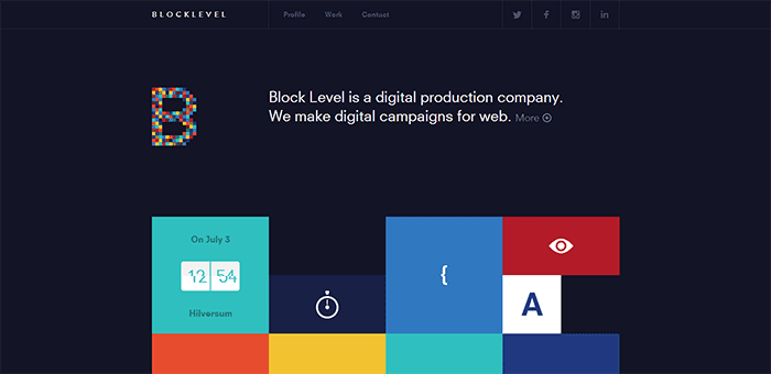

Again a task bar has been placed upon the top of the website to allow for an easy navigation. A strong san serif has been used throughout in order to convey legibility. Large images have also been used in order to make an impact.

The centralisation of this website allows for a design in which can be easily seen upon a mobile browser. Again the taskbar at the top of the page, allows for an easy navigation. Three typefaces have been used throughout, each typeface being used for a different form of hierarchy. A balance between text and image has been applied in turn making the design appear as if it contains some form of equilibrium.

Three colours have been used as this websites basis, in turn promoting the idea of a clean, clear design. Colour has been used in order to highlight key information, I believe that this may be relevant to my own design.

Problem and solution
When developing a user interface it is essential that it solves a problem, as otherwise the interface will not be used. When thinking specifically about what the problem is in this case, it is evident that the issue relates to the lack of females in creative jobs.
Therefore the website attempts to resolve this issue by highlighting female design in conjunction to the publication. The website also allows for a platform in which can express further design work, as well as effectively promoting the collective.
In more straight forward terms:
The website will aid the publication in a attempt to highlight female design, in turn aiming to bridge the gap of gender differences within the creative industry.
Is there a market for this website?
When thinking about whether or not there is a market for a website of this kind, key considerations have to be put in place.
Firstly, the aim of the website would be to inform individuals of the collective, as well as promoting female design. Multiple individuals would interact with the design, although it will be specifically marketed at male creative directors aged 35-55. This therefore linking the interface with the previously developed publication.
The intension of the website will be to act as an open platform in which is accessed in order to gain more information about the collective by creative directors who have already seen the publication. More female work will be explored upon the website as it is a cheaper alternative to making a large scale publication.
From this I would suggest that there is a target market for the website as creative directors will be on a constant 'hunt' for creative talent, and inspiration.
What elements do you look for within a website?
In order to gather a greater understanding upon the target audience I asked ten males between the ages of 35-50 what they believe to be useful websites/interface features. The way in which I gained this feedback was by posting a survey upon Facebook. I believe that I only got the responses I did due to myself having a lack of 'friends' in this demographic.
Question one: What websites do you use on a daily basis?
Question two: What do you think makes a good website?
Question three: What platform do you use to access the internet?
Question four: Do you prefer websites in which express less text?
Question five: Why do you use the internet?
What websites do you use on a daily basis?

From the researched gathered it is evident that Facebook is used everyday by 7 of the 10 participants, in turn suggesting that this demographic is far more tech savvy than previously thought. All participants also stated that they use the internet everyday, whether this being for personal use or to assist with work. Gmail was the second most used website, as just over half use this everyday.
When analysing this research it is evident that the consumer only visits 'essential' websites everyday and thus it is unlikely that the female collective website will be visited by the same individual everyday. This must be considered when designing.
What do you think makes a good website?

As I wanted to gain a greater knowledge upon what this demographic deems to be essential features of a website, this was asked within the survey. It was discovered that the key feature was that of loading time, this most likely being due to users having an attention span of 8 seconds (over twice as long as millennials). The second feature mentioned was that of navigation, with legibility closely following. As a result of this these features must be outlined within my own website.
What platform do you use to access the internet?

From the research it became evident that the majority of this demographic use either a computer or laptop to browse the internet. As a result of this the development of a website is a suitable format.
Do you prefer websites in which express less text?

It is evident from this that this demographic prefers a website to contain less text, and display more images.
Why do you use the internet?

From the information discovered it is evident that this demographic use the internet mainly to gain information, although they do also use it for a form of entertainment.
As a result of completing this exercise trends can be gathered surrounding the ways in which this demographic interact with the internet and the reasons in which they use it.
Subscribe to:
Comments (Atom)