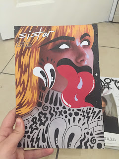
Sister magazine
Sister is a biannual, feminist magazine, focusing on female talent and culture. As a result of this, large proportions of the contributors are female, as well as the editors.
In terms of content, there is a range of issues tackled, as well as light-hearted articles surrounding everyday life. The content is broad and would appeal to a large audience.
When thinking about the publications aesthetics, it is key to note that a feminine colour palette has been used throughout, although this is broken down by other colours in order to promote a more engaging design. When outlining type and legibility, all titles are formatted in a similar way with the same typeface, this promotes a clear, consistent design. Flush left has also been used in order to embed this further. The imagery used throughout the design varies, with a range of photography and illustrations being present.
Polyester
In terms of content, a focus is upon female creatives. The topic areas are varied, and explore a range of subject matters.
Focusing on largely pink spreads, the design aesthetic explored remained highly 'kitch'. A variety of typefaces have been used in order to promote this. In some circumstances, the type appears difficult to read and therefore promotes a postmodern design. Pinks and purples have been used throughout in order to embed stereotypical 'girliness', this being highlighted further with glitter and love hearts decorating the publication.
Mushpit
Although I had previously enjoyed the pink, feminine nature of later mushpits, I was only able to buy their latest copy, issue 10. The general colours running throughout were black and white, although other colours have been implemented in order to create a visually intresting design. In terms of content a variety of subjects are discussed, being accompined alongside 'fake advertisments', creating forms of parody. A range of iconography has been used, including photography and illustrations.
Information gained
- By embedding pink within the design, it forms a rhetoric of mimicory towards the negative attitudes associated with the colour.
- Although a range of typefaces embodies postmodern trends within the design, this can also make the publication difficult to digest.
- Parody through fake advertisments can be an effective way in which to engage the consumer.
- Flush left is generally used in order to promote legibility.
- By adding imagery where there is a vast amount of text, this makes the task of reading the information less daughting to the consumer.
- Some form of grid system is generally in place in order to create structure.


No comments:
Post a Comment