After Liv's talk, I did further research into Rough Trade magazine as I felt that the design style would be suited to the feminist publication. From this, I uncovered a range of spreads in which I felt promoted postmodern trends. As postmodernism was a design trend in which allowed female designers into the creative industries, I believe that this may be a style in which would promote context.

Although no colour has been used in the above spread, it appears highly impactful as a result of shapes and text. This should be explored within my publication as it may reduce the printing costs if manufactured professionally.

Large images have been included in order to promote the protagonist, in the above case Sadiq Khan. The handwritten type gives the article expression, promoting that the words are true. It also gives the magazine an organic feel.
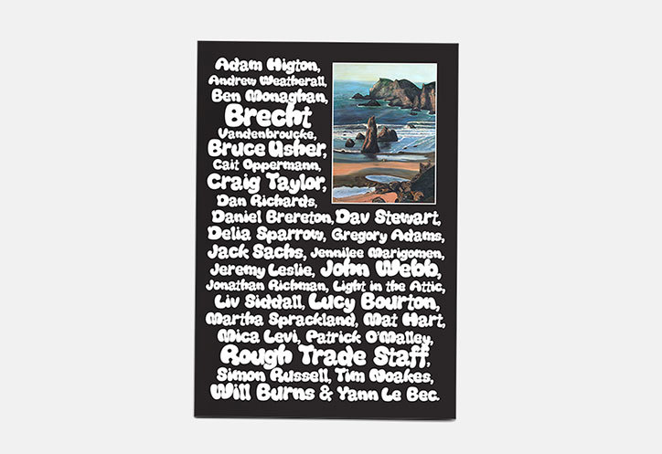
The reverse cover of the magazine highlights all those who are involved. I believe that this is highly effective as it doesn't leave a single page blank. I also think that this involves everyone within the publication much more.

The usage of text hearts in the above case looks somewhat similar to that of a girl's magazine and thus a similar style would be effective within my publication, developing irony through design.
No comments:
Post a Comment