Sunday 31 December 2017

Ethical implications


Ethical implications have been considered in order to ensure that no individual finds the publication offencive. As I am dealing with issues relating to race, gender, rape and genital mutilation, it is essential that care is taken. As a result of this feedback has been gained throughout all design stages, ensuring that anything that may be deemed offencive has been eliminated.

Key features listed:


  • don't include visual representations of the issues themselves 
  • do think about diversity, especially when depicting people
  • don't use insensitive language 
  • don't imply subjectivity towards an article through design (don't impose my opinion)
  • do get the content checked

Born a girl in the wrong place

Topic:Genital mutilation
Theme: creating awareness
Reasoning's: The design has been developed in a way in which carefully highlights a difficult issue.
Considerations: How will women of GFM react to this? will they think it is a fair representation?


A variation of images were explored, including more graphic content and diagrams, although this felt some what insensitive towards the issue. As a result, iconography was selected in which may showcase the initial stages after GFM. 


The body copy presented, surrounding the image, highlighting it. This in turn making for a visually pleasing design. 


Yellow was selected as the base colour as it compliments the purple presented within the illustration. It also makes the design appealing, and therefore would promote the consumer to read the article. 


Key words within the article were highlighted in order to promote how GFM makes people feel, and to showcase that it is not just the event but rather the events to follow in which effect the individual.

Muslim feminists


Topic: Muslim feminists 
Theme: Removing connotations 
Reasoning: As the media frequently portrays Muslims in a negative light, this was physically envisioned within this spread as it mimics a newspaper. 


A sideways composition was explored in order to mimic that of a newspaper. Flush left was also used in order to highlight this. As the spread is positioned upon its side, this will cause the consumer to turn the magazine, in turn creating a physical experience for the consumer. And so, the information represented is more likely to stay with them. 


The image selected (two tone) also mimics the two tone nature of newspapers, this further embedding the sentiment within the design. 


A range of compositions were explored. In some circumstances the body copy lies over the crease. In order to ensure that legibility is promoted and the words are not lost, a gap must be promoted. 


Feedback


  • Peers suggested that the sideways approach was innovative, and would make the consumer stop and think about the content. 
  • The colour pallet was said to be effective as you do not traditionally associate Muslims with the colour pink. 
  • The type is legible, and is easy to read
  • The image appears best in the sideways context, relating to the newspaper theme. 


My body as a Utopia

Topic: My body as a Utopia 
Theme: Body image 
Reasoning: As the media often has negative connotations surrounding body image (as seen within my dissertation) this was attempted to be combated. 


The iconography selected attempts to envision the negative connotations surrounding body, and how indulgence is seen as highly unfavourable. An illustration of a female body has been highlighted in which does not showcase unrealistic expectations, but rather so an 'average' body shape. The leg hair presented also highlights that women should not feel the need to complete unnecessary actions to please the male. The composition will be further explored in order to ensure that balance is created. 

Glorifying selflessness


Topic: Glorifying selflessness in women 
Theme: Focus on the female symbol
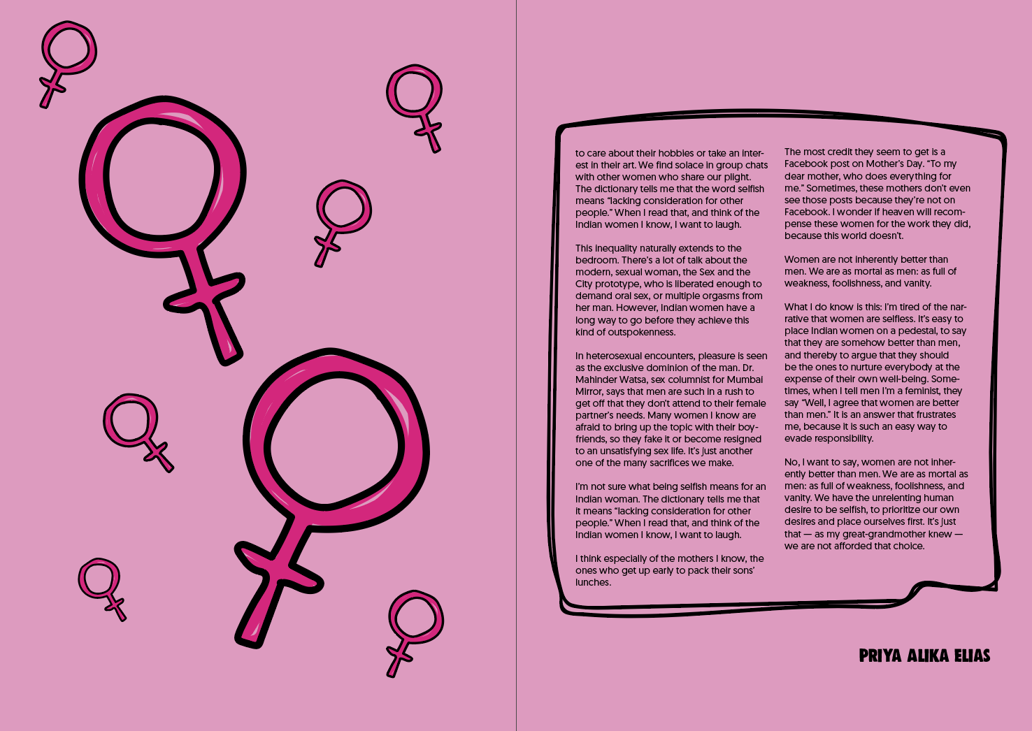
Reasoning: Although this could have been presneted through a range of iconography (for example 50's housewives), a symbol approach was taken, to promote even at its route, women are symbolised to be different from men. 


In conjunction to the previous spreads, key design traits were carried through, including type and type setting. In order to promote the other spreads further, organic shapes were devised, outling specific areas of text, making for a more visually intresting approach. 


A black outline was added to the female symbol in order to develop hierarchy upon the page. This ensuring that the attention to the iconography is instant, embedding the topic area visually. This also helps to balance the opposing outling. 


The pink aesthteic of the design promotes the trends resembled within the magazines context. The over usage of feminine atriibutes promotes pastiche towards other publications such as Polyester, in turn creating continuety for those already intrested within feminist publications.


Does this style relate?

As the spreads throughout promote a range of illustration and colour, it came to my attention that the female anatomy spread only maintained 3 colours, and as a result the above design was developed. This ensuring that links within the magazine are made, and that no one spread appears to be a one off.

Reclaiming pink

Topic: Reclaiming pink
Theme: a celebration of pink
Reasoning: the removal of negative connotations surrounding the 'girls' colour.


Variation one 


The first design developed promotes that liking pink and being intelligent are not mutally exclusive. This has been devised through an illustration represneting this. A variation of compositions were explored in order to promote an intresting, legible design. 


Variation two


The second variation explores a bright pink background, in order to visully represnt the content. The illustration used depicts the female body, further envisioning the content. The illustration has been used amongst the text in order to 'break down' the vast amount present, in turn making the design appeal to the consumer. 


Variation three 


Promoting a simplier design, the above approaches, showcase a design in which focuses directly upon colour. The organic shapes used promote the soft femimity traditionally associated with women. Again, promoting the rhetoric of mimicory. Weight has attempted to be balnced between type and image. 


Feedback

  • The third attempt relates most to the context 
  • weight is clearly balanced. 
  • use the main typeface to write the text within the heart-craeting continuety


As a result of the feedback, the final spread will be further explored with. 


Creating continuity

As it was previously stated within a critique that the pages did not coincide with one another, it was decided that key traits would be presented within in each.


Type


The selected key typeface was that of DK Woolwich. The curved, organic nature of the typeface relates strongly to traditional femimity. This alongside the bold, strong weight is perfect for gaining attention and promoting the power of women.


The typeface for the body copy is that of Geomanist. The beautifully simple typeface, promotes a contemporary style, showcasing that the issues within the publication are relevant and currently happening. Geometry and rhythm have been used throughout the type in order to develop a lively but trustworthy font.

In terms of type size, 9pt has been used throughout for the body copy, with the titles altering depending upon hierarchy.


Colour scheme

The colour scheme used throughout promotes pinks and light hues. This in turn ensuring that all pages coincide well with one another.


Circling, and outlining


As an added element towards the design, key aspects have been highlighted through the usage of organic shapes. As this occurs throughout the publication, continuity is drawn.

Saturday 30 December 2017

Creatives contacted


In conjunction to the loss of photography, and in relation to the critique whereby illustrations were highlighted as the method of choice. Further illustrators were contacted. The two in which I beileve to be most connecting to a young audience (through their instgram and twitter followings are listed below.


Madelaine Walker


Following a simple illustrative style, the feminist content developed by Madeline would reach to the youthful demographic. Many topic areas are covered within her work, including key feminist topics mentioned. She also visually promotes issues in which are often listed as a taboo, and are rarely depicted visually. As a result, I would suggest that Madeline's work would stand out and create impact. 


Genevieve Darling


Genevieve uses a range of mediums to develop niche illustrations in which largely include women of a range of ethnic origins. With large social media handles, it may be suggested that her work is already popular amongst the intended demographic. Feminine colour pallets run throughout her work. 


Friday 29 December 2017

New sketches


In conjunction to the feedback gathered, further spread sketches were devised. As the magazine is to follow more of a zine structure, rather than postmodern this was considered. It was also considered as to how I can showcase illustrations, in turn promoting the female creatives behind them.

A range of spreads were outlined, promoting how both double page, and single page spreads can be presented. This being essential as the articles range in length. As I am yet to explore purely with illustrations, these sketches are a rough guide, and are subject to change, as I explore with layouts using CAD.

Critique


General Feedback 


During the feedback session, the following points were outlined


  • As a result of the mixed media, the spreads do not seem to coincide with one another
  • The photography looks out of place
  • Photography promotes a sad realism to the rape article, and may be insensitive 
  • The usage of word searches/horoscopes contradicts the intellectual content- its not suppose to mimic a traditional women's magazine. 
  • to promote further consistency, it might be a good idea to use the same typefaces throughout, even if its just a base before adding others to it 
  • The varied colour pallet is effective 
  • The 'cunt' spread appears bold and impactful. It catches the consumers attention 

Where the publication can go from here-feedback 


When discussing how the publication should be formatted (in consideration to the lack of photography), it was suggested that I could develop a magazine in which contains only illustrations. This in turn completely contrasting traditional women's magazines as they are largely built from glossy images. This also promoting female creatives in the process.


My thoughts 

When thinking about a fully illustrative magazine, it may be suggested that there are both positive and negative criticms to be noted. If an illustrative approach is to be taken, it is essential that the design does not mimic a comic book. It is also essential that the illustrations coincide with one another, making the publication flow. It is also key to note that the design may mimic a zine more if it is built from illustration and type, relating it back to the birth of female design. This in turn ensuring the publication has contexual routes.