Monday, 25 April 2016
Synthesis
Throughout my practical work I have made multiple connections to that of Obama's Hope campaign, with my practical work focusing upon the candidate in which will take over from the President. The campaign in which I have developed for Hillary focuses upon the targeting of youths a factor in which also applies to that of the Hope campaign. A relationship between Gill Sans has also been expressed in order to suggest that Hillary is strong and stable just like Obama. Patriotic colours have been an influence in both designs with Hillary's campaign expressing many characteristics in which mimic Obama's. From the information expressed above I believe it is fair to suggest that my practical work and essay coincide well together.
End of module evaluation
Personally I believe that the last module has given me a greater understanding surrounding that of theories within design, and has opened myself to concepts in which were previously unheard of in my college course.From the lectures I have a greater understanding upon modernism/postmodernism two factors in which I feel myself employing to that of my analytical feedback within other modules. Other influencing lectures I feel have stood out to me are that of consumerism and colour, with colour theory being highly prominent within my work.
The essay itself was a component in which I enjoyed to write as I found it a highly interesting topic area. As I like to believe that I have an extensive knowledge upon British politics, I felt that this essay allowed me to look deeper into that of America's. A factor I feel important as America is one of the most influential countries within the world. Choosing the right essay question was important to me as I wanted to gather greater knowledge upon a specific topic area. In an attempt to push myself to unknown boundaries marks were probably lost as I had to gather knowledge rather than rehearse previous, this being the main reason in which I did not select the gender question as I extensively studied it in my A levels. As within school I never exceeded within English, I really pushed this essay in order to gather the strongest result possible, a factor I am happy with when reading back through it.
The physical body of work links closely to that of the current 2016 presidential campaign whereby I focused specifically upon promoting Hillary. The three posters were targeted specifically at a younger demographic 21-30 years, in order to gather attention from minority voters. This also being a factor in which Obama's PR attempted within his Hope campaign. The designs themselves focus upon issues rather than the protagonist, a factor in which I believe to give my designs a personal edge. Overall, I am happy with my outcomes although if I had more time I would like to develop them further.
Saturday, 23 April 2016

Comparing the posters


When developing the posters I wanted to maintain some form of continuity and thus the typeface and colour schemes remained the same throughout. I also attempted to use image in a similar format although I feel the gun crime poster doesn't express this coherently as well as the others.A tag line was expressed through a highlighted format on each, with a similar type size also being used. In order to make the connection back to Hillary her logo was also used, this appeared alongside a short slogan for example 'Vote Hillary for Sustainability'. This expressing continuity alongside a difference between each design. I believe that the designs are recognisable to each other and work effectively as part of a set, as well as individually.
Which logo to use


When deciding upon how to link Hillary with my campaign her logo was an obvious choice. As she had two logo's, with one containing text, I decided to choose between the two in order to express continuity within my designs. As a younger audience is seen to be more aware of logo's, I decided that the symbol approach would be much more effective. This logo is faster and straight to the point, a factor in which is more appealing to a younger demographic than that of the formalised logo.
Gun poster evaluation
The sentiment of displaying multiple people alongside one another linking hands was to express the unity of America in a time whereby gun violence is at its highest. The people themselves were depicted in blue to suggest that they themselves had no reasoning to be targeted. The usage of one colour also express the idea that any person, any race may be involved within gun violence. I felt this was important to outline, as it is often associated that more young black males in America are involved within gun crime.
The design itself breaks away from the block colour background in which is expressed within my other posters. This would definitely be a factor in which would divide the poster from the others, and thus if I were to develop the design again I would explore with following a similar format.
As the deisgn is built up from multiple sections it appears much more interesting than that of the other designs, a factor in which I feel will consume the demographic for longer, and thus they will take more of an interest.
Gun poster final crit
When taking my designs to the final crit I was unsure upon which design should be selected, and thus I developed a tally in which my peers could vote for each design. From this I found that the 'people' approach was far more impactive than that of the video game, with the illustrative people forming an interesting background.
It was suggested that the design should explore a less restricted male, female, male, female approach. The idea of using multiple people was also expressed, as this would suggest different age groups being affected by gun violence. This is definitely a factor in which I would explore if I had more time.
It was suggested that the design should explore a less restricted male, female, male, female approach. The idea of using multiple people was also expressed, as this would suggest different age groups being affected by gun violence. This is definitely a factor in which I would explore if I had more time.
Final evaluation environmental poster
The general house style of this poster explores the same colour palette and illustration style to that of my previous designs. The merging of both the image and the background explores the concept that the Earth is slowly fading away due to human impact. This is then embedded further with the usage of a warning banner depicted in red, a factor in which rounds up the design. The design itself is impactive and would grab the consumer's attention a factor in which I believe to be extremely important when developing poster designs. Hillarys logo is again positioned within the design, and important factor that allows Hillary to be expressed within the poster.
If I were to re-develop this design I would definitely focus upon making the design bolder, a factor in which I feel would alert the consumer more. Maybe the dripping of blood would enforce the realistic outcome in which pollution is killing our planet.
If I were to re-develop this design I would definitely focus upon making the design bolder, a factor in which I feel would alert the consumer more. Maybe the dripping of blood would enforce the realistic outcome in which pollution is killing our planet.
Environment poster final crit
When taking this design to the final critique it was suggested that the imagery used was far stronger than that used earlier as it depicts a futuristic image rather than one in which depicts an everyday occurrence, a factor which in turn specifically appeals to a younger demographic.
The usage of colour within this design is far more impactful than that used previously, with the red highlighted text exhibiting danger. The blue background expresses the universe much more coherently than that of the red or white, a factor in which I strongly debated with when developing the design.
Overall the design follows a format in which links closely to that of the abortion poster, with text, colour and compositional factors appearing the same, an important asset when deriving a set.
Final evaluation of abortion poster

constituent in which widely practices nationalism with days such as the 4th Of July being key events in each individual's calendar year. And thus the colour scheme strongly embeds that of American culture within the design, a factor in which is most likely to appeal to that of the American audience.The colours being used within a political format suggest Hillary as being widely passionate about her country as well as denoting her as strong, independent and powerful leader. All factor in which are likely to gather her attention as a candidate for the 2016 election.
The illustration used is simplistic and hard hitting, two factor in which were developed intentionally in order to gather the attention of a demographic in which is often associated with being lazy when seeking out information.
The usage of a highlighted component amongst the text allows it to appear impactful against that of the highly poignant imagery, a factor in which positions the audience in a manner that would see them voting for Hillary.
I believe the concept itself is strong, as when seeking other similar conceptual designs I felt very hard hit behind the realisation of the coat hanger symbolism. I also believe that the intended demographic would also experience this.
The usage of Hillary's logo within this poster is an important factor in which symbolises that her polices are more important than herself, an idea in which sets her aside from that of her competitors.
Final Crit abortion poster
When taking my design to the final cit it was suggested that one of the strongest components within this design is that it is built up of American iconography including illustrations, typeface and colour scheme. These all being factors in which relate to that of the American demographic.
The illustration itself was seen to be simplistic, a component in which would allow it to appear legible from a distance. This would be an important factor when deciding upon how the poster will be displayed. Criticism surrounding the illustration suggested that the relationship between the coat hanger and America wasn't clear, with suggestions being made surrounding ways in which the coat hanger and America may be positioned to make the concept more obvious.
The concept was seen to be strong, with a large proportion of my peers suggesting that it was hard hitting enough to gather the attention of a younger demographic. The designs simplistic and impactful nature has also been seen to express this.
Friday, 22 April 2016
environment poster drawings


Following my research I began to explore ideas in which invitably exhibit ways in which environmental issues can be displayed. A range of concepts were developed ranging from deforestation pieces to that of large corporations polluting the planet. As Hillary's manifesto largely focuses upon renewable energy I specifically looked at the effects on the world if no action was taken.
The designs in which I perceive to be strongest are that of the melting Earth and polluting factories. I decided upon these designs as I felt they were most effective at grabbing the consumers attention. I also believe that these designs could be really pushed into a strong final piece.
environment poster final

Following my drawings closely, a melting Earth was developed. A factor in which expresses reality to youths.


Colour was widely explored as I felt that a more realistic colour pallet would position the consumer to believe in the reality of the issue. I also felt that this was an important factor as the illustration expressed didn't follow a realistic format.


Text and colour was then explored, with the red approach expressing further danger, this in turn somewhat scaring the consumer. Composition and scale was also manipulated, with the smaller Earth feeling more intricate. By scaling the Earth smaller it also appeared the same width as the text, this in turn balanced the poster.

When expressing a red background the design appeared to not coincide with the poster. As the universe is usually depicted in a black/dark blue colour the red contradicts what the consumer recognises the universe to appear aesthetically, in turn uncomfortably positioning the audience.


As I had previously recognised the red exploring the Earths demise, I felt that a highlighted red approach may successfully connote this. I explore with a white background but felt that this didn't appeal to a younger demographic and thus explored further with colour.

As the Earth contained blue aspects I was unsure whether a blue background would clash with the already present tone. Once the background was applied I no longer found this, and felt that the difficult to see Earth appeared as it was fading, a factor in which applies strongly to the designs concept.
environment poster one and crit

To begin this design I explored imagery, a factor in which I feel an important influence when gathering youths attention. The desolate image depicts a dark unnatural smoke filled world, a dingy outlook onto what may become a sad reality for that of a younger demographic. The image being captured within a circle is a symbolisation for the world, in turn expressing a world full of pollution.

Using the image as an influence I experimented with tag lines, choosing a phrase in which is suitable to the image as well as the demographic. With the world 'future' being expressed it states that action must be made or there will be a limited future. This symbolises Hillary as someone who is able to tackle large, international issues.


Colours were then explored, with the usage of the highlighted approach being used in order to maintain consistency. I felt that the design appeared highly separated due to the gathering of white space within the image.

Due to this I decided to explore with the colour palette, suggesting a white background. Although this had made my previous designs appear clinical I felt that the composition of this poster set it against the other designs. Again a tag line was used in order to position Hillary as a strong leader with the phrase 'vote Hillary for sustainability'.
When taking this poster design to the intermediate crit it was suggested that although the concept behind the piece was strong, the relevance to that of a younger demographic was weak. The deisgn itself is very structured with the illustration being formed from that of shapes, a factor in itself that goes against the free individual nature of youth and complies to that of an older more restricted demographic. The ways in which the patriotic colours have been displayed is also a factor in which limits the demographic as it appears very formal. Suggestions were made that the idea of a melting Earth would appeal to a demographic in which is unable to visualise this relivantion.
Thursday, 21 April 2016
environment poster research

The above design explores the melting of the earth due to carbon emissions. The approach in which depicts the earth physically melting expresses an idea in which would be terrifying to the younger consumer who is going to have to experience the effects of humans on the earth.
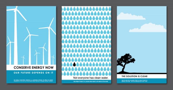
These posters are part of a set in which explore renewable energy. Their house style is similar with simplistic illustrations being used in each. The colour palette, text and composition all follow a similar format.I must ensure that my own set of posters follow a similar format.


The usage of nature within these designs embeds the concept further as it develops a personal relationship to the consumer in connection to the issue. As leaves are part of humans every day iconography the consumer can also easily connect and relate to the issue, in turn perceiving the data being represented as trustworthy.

A comical approach in which would target that of sci-fi fans. As star wars has also developed further films recently this is also a good marketing technique for both causes,

The phrasing of the text within this design would suggest that the intended demographic for this piece is middle aged parents. The mentioning of child is a factor in which relates to them more personally than that of a younger demographic. Within my own piece I must ensure that the correct phrases are used in order to position the design to the right audience.
Gun poster 3 pushed further

As the colour scheme was slightly off from that of the American flag I altered the colours. I did this not only to create contextuality but to also keep consistency with that of my other designs,

The text was then centralised with a left flus being used, I did this in order to convey to the rules within Vignelli's cannon, as he suggests this enforces legibility.
The slogan 'vote for Hillary, vote for change' was also used in order to sum up the piece and give further reference to Hillary.
gun poster 2 pushed further

Taking suggestions from the crit I explored with the positioning of the now minalised remote. Although this design maintains black ( a colour not previously used within my three tone approach) I felt that using any other colour would take away from the aesthetics behind the design. The text was explored with, in turn allow for a cleaner approach.

I involved the iconic Hillary logo in order to express Hillary's relationship to the poster and her polices. This is an important factor that I must apply to all my designs if I want them to appear consistent.

As the colour pallet wasn't previously identical to the American flag I altered the scheme in order to comply to that of the other posters. I felt that this was an important factor as I wanted to embed nationalism within my design. I also added a caption by the Hillary logo to suggest how Hillary is going to resolve the problem. I felt this is important as otherwise its suggesting a problem and no solution.
Gun poster crit
Within the critique it was suggested that the 1st approach could be explored a lot further as the basic white background again feels somewhat clinical. The design also doesn't follow the same consistency as the other designs, as the text is not highlighted, and in this example the text appears too large and over powers the image. It was also suggested that the circle background should be removed in order to promote a more friendly design in which explores the pages space more effectively.
Within the 2nd design it was suggested that the negative space works effectively at displaying the two pictures in order to build concept. It was also suggested that this approach would engage that of a younger demographic. In order to improve this design some form of background would be needed, this in turn keeping consistency with the other posters.
The 3rd design gained that of the most positive feedback with the general layout and concept being suggested as very effective. It was also suggested that the minimal nature would appear to that of a younger audience. Other key iconography suggested to be included is that of other relevance to the campaign, such as Hillary's logo.
When asking my peers which designs I should develop further they suggested designs 1 and 3 as they explore a context in which is most likely to connect with youths. The captions are also highly relivent to that of a younger demographic, as they are specifically worded to speak directly to this audience.
Gun poster variation 3-people

Following my drawings I began to explore ways in which image and facts may be represented. The concept behind this piece is that the linking of the peoples arms suggests unity, a factor in which is relevant to Hillary's campaign and also that of gun violence. Hilary's manifesto suggests that America can only be rid of gun violence if laws are put in place and citizens abide them, this is a factor in which I feel relivent to the linking of hands as this suggests the coming together of people.

In order to express the severity of mass shootings I explored the usage of multiple people, I also thought that previously the two appeared as a couple and brought attention away from the actual concept. The placement of text in a highlighted format allows the text to stand out, as well as keeping consistency with my previous designs. The colour red was used in order to denote blood, a factor in which contributes to the highly devastating result of mass shootings.
Gun poster variation 2-

Following my drawings closely I began to expore with ways in which express the gun shooting through the typography, in order to connote a terminating of life early due to gun violence.


Phrases were explored with college and party's being the main topic area. I did this in order to develop design in which is relatable to the consumer audience, as these are factors in which they frequently occur. I then manipulated the smoke to overlap the words in an attempt to express gun violence as destroying futures unexpectedly, a component in which I feel the target audience would relate to.
Although I liked this concept I felt that the smoke appeared very fake and that the text appeared illegible, a factor in which contradicted the main idea of a poster. Due to this i then began to explore with negative space within a gun.


I explored with ways in which negative space can be positioned within the gun in order to suggest a car. Multiple cars were experimented with in order to portray shape correctly, I felt that the slanted car appeared far more dangerous than that of the curved and thus I decided upon this approach.

Composition of type was explored, with the above design mimicking the outline of the gun. I did this in order to denote the attention towards how powerful the gun was.


Type was then further explored with a relationship being made between the highlighted aspect in the previous poster.


In order to create consistency with my other designs I decided to involve Hilary's logo. Not only does this create a relationship with the other posters, but it also further embeds Hillary within the campaign. The logo is present at the bottom right hand side of the page, I have done this in order to suggest that Hillary is about her polices rather than herself, a factor in which sets her aside from other candidates.
Gun poster 1-video game

The image used in the above piece is simplistic, modern and does not express any connotations towards a certain brand. The phrase was slightly re-worded in order to position the consumer to a directed outcome, that Hillary is the way forward.
The design itself is very minimal and boring, a design factor in which i will have to alter if I want to take this piece further. Within the next crit I will discuss the ways in which this design maybe be strengthened.
Gun Drawings and crit

After deciding upon gun crime as an important issue to a younger demographic, I decided to think about ways in which I could effectively communicate Hillary as someone who is going to decrease the gun violence death tole each year.
Following my research I began to look at iconography surrounding gun crime, this mainly consisted of guns, bullets and smoke. Taking influence from the general aesthetic surrounding gun crime, I began to explore concepts in which would target that of a younger demographic. These contained fast phrases in which specifically outlined young peoples relationship to gun violence.
I felt that the strongest concepts developed were that of the video game approach, Guns kill as many people as cars, the only shoot you should be in and the people approach.
The video game approach focused specifically upon a younger demographic, as video gaming is a factor in which is often associated with youths. In a recent study it was found that the the majority, 75%, of gamers are between the ages of 15-35. An category in which captures my set demographic. Other studies also suggest that the demographic for gaming isn't necessarily male dominant, with 40% of women playing video games at least once a week. I feel that this is important as I don't want to neglect a certain gender within my posters. The tag line stating 'Video games don't make killers, guns do' is a factor in which I personally believe to specifically target this demographic. As it is commonly acknowledged that aggressive video games are often blamed for gun violence, when in fact it is the individual themselves mindset. As young people often have to protest to their parents about how video games are unrelated to death roles, I feel that this idea captures their views.
The 'Guns Kill as may people as cars' approach is hard hitting as car deaths have been excepted as a component in which cannot be effectively reduced. It also creates a realisation as cars are common, and thus seen by the consumer everyday, whereas guns shouldn't be. I felt that using negative space within my approach would allow for a design in which expresses an extra layer, this would also capture the consumers attention for longer.
'The only shot you should be in' approach explores photography and cameras in a relation to that of gun crime. When conducting some research into the idea of cellphones and guns I discovered that in America there is only a couple of thousand difference in their production, a factor in which realistically should not be the case. With social medias such as Facebook and Instagram being highly prominent within youths lives it is easy to suggest that the relationship in which a young demographics explores photos is completely differing to that of an older, and thus this concept is more specific to them.
The 'people' response explores the usage of basic people both male and female existing alongside one another holding hands. I did this in order to suggest happy coinsistance whereby gun violence is not necessary. A quote suggesting the amount of gun related deaths amongst young people will also be involved in order to specifically target the set demographic.
Crit
When discussing my ideas within the critique it was suggested that the strongest ideas were that of the video game approach, 'Guns Kill as may people as cars' and the 'people'. These three were suggested as it was stated their concepts were the strongest. It was also suggested that these ideas targeted the consumer more specifically.
With the video game approach it was stated that a game console should be simplistic and not display a specific product as this may express marketing. It was also suggested that the design should be minimal in order to target people from a distance.
When discussing the 'Guns Kill as may people as cars' approach it was suggested that negative space may be used to build the barrel of the gun as well as the trigger. The negative space idea was highly commended as it was suggested to gain more attention from the consumer.
With the people response it was commanded that both secs were highly represented, but it was suggested that more people should be placed within the design to express the mass scale of shootings.
Subscribe to:
Comments (Atom)