Following my drawings closely I began to expore with ways in which express the gun shooting through the typography, in order to connote a terminating of life early due to gun violence.
Phrases were explored with college and party's being the main topic area. I did this in order to develop design in which is relatable to the consumer audience, as these are factors in which they frequently occur. I then manipulated the smoke to overlap the words in an attempt to express gun violence as destroying futures unexpectedly, a component in which I feel the target audience would relate to.
Although I liked this concept I felt that the smoke appeared very fake and that the text appeared illegible, a factor in which contradicted the main idea of a poster. Due to this i then began to explore with negative space within a gun.
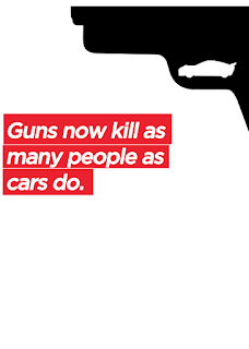
I explored with ways in which negative space can be positioned within the gun in order to suggest a car. Multiple cars were experimented with in order to portray shape correctly, I felt that the slanted car appeared far more dangerous than that of the curved and thus I decided upon this approach.
Composition of type was explored, with the above design mimicking the outline of the gun. I did this in order to denote the attention towards how powerful the gun was.
Type was then further explored with a relationship being made between the highlighted aspect in the previous poster.
In order to create consistency with my other designs I decided to involve Hilary's logo. Not only does this create a relationship with the other posters, but it also further embeds Hillary within the campaign. The logo is present at the bottom right hand side of the page, I have done this in order to suggest that Hillary is about her polices rather than herself, a factor in which sets her aside from other candidates.


No comments:
Post a Comment