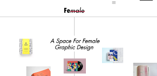
Although the wireframes were developed, I decided to explore with some different compositions, to ensure that the intended design is most suitable. The first design explores the images depicted within circles. Although this was interesting the row approach appeared very modernist. The relationship of circles does also not apply to the publication, and thus this idea was ruled out. The second deisgn follows a strict grid system and therefore does not comply to the postmodern trends expressed both within the essay and publication. As a result of this it was decided that the wireframes should be the basis of the design.
As line work was expressed within the wireframes, I attempted to mimic this using CAD. A slogan was derived for the landing page, in order to instantly inform the consumer about the reasoning for the website. This was expressed in Futura, in order to comply to the previous design set for the publication
From this the general composition was explored. The collective's name was expressed at the top left of the page. This is to allow the collective to be effectively embeded within the website. A pink background was explored, although I personally felt that this took away from the images. As within the research the general design of websites was white.
As the fully coloured approach appeared too crowded, colour was added purely to the header. Although this allowed the header to be highlighted, it somewhat separated the design. The same pink was used as within the publication, although I believe it does not have the same effect due to RGB considerations.
As a result of this a fully white background was expressed. The original logo was also incorporated into the design. The burger symbol was also placed in the top right of the page, this will occur on all pages in order to express continuity. This is essential, as the market for this design likes familiarity.
Although the original spreads only explore female design upon the original page, I decided to explore further with the movement of the page. As a result of this the page was divided into three sections, that can be explored through an up/down scroll movement.


No comments:
Post a Comment